Showing top 0 results 0 results found
Showing top 0 results 0 results found

OK, so someone clicked through to your web page…
COOL.
But that’s just half the battle.
Getting people to your online resources is a highly significant part of inbound marketing, but this is just half the battle. The next round starts once users are on your site. See, this struggle is all about keeping them there and pushing further.
You should always look at the big picture.
You need to develop a smart overall marketing strategy that lets you operate on your battlefield intelligently, to eventually win the whole war and enjoy the glory of a successful sale. 😉
A clever marketing strategy comes down to driving your website visitors through your conversion funnel deeper and further to finally turn them into your customers.
And, for most brands, this is not the end of communication either.
Well, unless you are an affiliate marketer.
In fact, your overall website content and design needs to kick ass – be optimized for conversion, absolutely engaging and has to keep users away from that back button.
This is where the CTA comes into play. It is one of the key ingredients that contribute to the conversion process.
Marketers of all kinds struggle with crafting the right headlines and CTAs every day. It’s no different for affiliate marketers.
What is a CTA?
The first step of creating robust calls to action is getting a deeper understanding of what a CTA is about.
In essence, a call to action is an incentive for conversion. It’s a conversion push that prompts your visitors to complete a specific on-site action that is relevant to the landing page. In Inbound Methodology, the whole process of converting searchers into clients is called the “conversion funnel.” The CTA kicks off the entire conversion process.
Without calls to action, conversions simply won’t happen, and you won’t be able to get new subscribers and orders. This makes a CTA an obligatory on-site element.
And are your CTAs efficiently capturing users attention? Learn how to craft actionable CTA’s and get your buttons clicked.
This article will:
- Show you major types of calls to action that you can add to your content
- Reveal some essential tricks that make your CTAs more actionable
It’s critical that you start paying attention to little things on your landing pages. Once tweaked, they’ll make a big difference. Remember: a small fix in the CTA can go a long way.
Let’s dive in.
Major Types of Calls to Action
There are several types of CTAs that you should bear in mind while creating your conversion funnel. Different CTAs are applied at the initial stages of your funnel.
In essence, all calls to action types serve one goal – they literally prompt your website visitors to take a specific action. And the action is a variable here that defines what this simple button is used for.
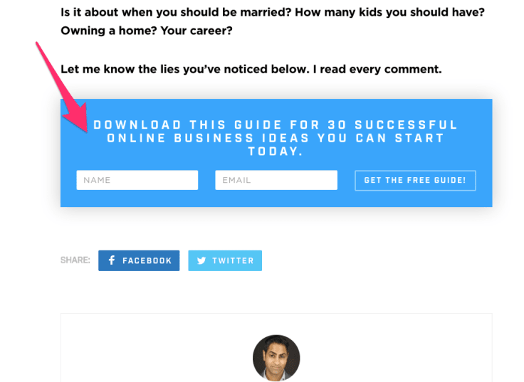
1. Lead Generation CTA
Generating leads from a website translates to collecting contact information about your site visitors.
Hubspot
Generating leads is a fundamental stop in an individual’s journey to becoming a delighted customer of your business.
This is your first interaction with a searcher who chooses your online resource on the SERPs, clicks through your result and from a complete stranger becomes your visitor.
Let’s, for instance, check search results for a keyword 'fat loss diet'.
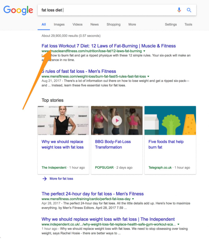
Let’s say we go for the second result, courtesy of Men’s Fitness. Once we click through, land on the page and scroll down, a full-screen welcome gate pops up after a while.
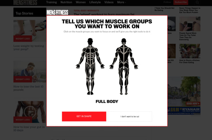
Side note: A full-screen pop up is said to be the next generation of call-to-actions. It allows you to turn any page on your website into your highest converting one. This can be a Welcome Gate or Exit Gate or even Interstitial Ads.
Ok, so getting back to this example let’s click on this red CTA button and choose ‘get in shape.’ What happens next?
The second step invites you to enter your email.
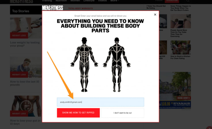
BAM! And this is how Men’s Fitness generates leads.
Now, we go back to you.
This specific CTA type is your opportunity to generate new leads.
Therefore, it’s essential that you put a CTA on any page with a high percentage of new visitors. This can be, for instance, a blog post because they typically serve to attract organic traffic from search engines and make the initial touch point with your visitors.
Making it a fullscreen overlay is a good idea.
Just assure it pops up after a while, say, after 30 seconds. Otherwise, such a full-screen popup may ruin the user experience and be the cause of a high bounce rate.
Also, make sure there is an option to reject the offer. In this example, there was a second (genuinely discouraging) button ‘I don’t want to be cut.’ And, most importantly, don’t forget to check if it’s there both on a desktop and a mobile screen. We live in the era of mobile so small screens cannot be neglected.
Use the same CTA, in different forms and with slightly modified wording, multiple times on one page. This way, if someone scrolls down passing the first CTA, then there is still chance to convert a user at the another placement.
Of course, your lead generating CTA can pop up in various forms:
Sidenote: Neil is extremely skilled at implementing various offers and CTAs to his resources. We all should be learning conversion rates optimization from him 😉
2. Form submission
Often, a submission form is attached to a landing page as the second point of interaction in a conversion funnel.
Credits: Ramit Sethi
Once a user clicks through your on-site CTA and lands on a dedicated marketing offer, there are two actions to take before finally becomes your lead:
- The user needs to fill out a given form with his contact information
3. Read more
Read more buttons are typically used as CTAs in your content newsletters. Also, they can be seen on your blog and on other content pages like, for instance, press releases.
Since you surely don’t want to display a full post on your blog’s homepage, you just present a collection of posts with short introductions in a user-friendly and scannable way.

Credits: Invision Blog
4. Demo request CTA
Demo CTAs can typically be seen on a homepage of a website that offers a sophisticated analytics software. Alternatively, companies build a dedicated landing page promoting demos like in the example provided by Optimizely (below).
A demo request is a CTA that allows users to get to know the product in a live presentation. Demos do a great job regarding helping people understand if a particular piece of software is right for them.
A personal touch and the opportunity to have all your questions answered in real time is always desired and highly appreciated by prospects.
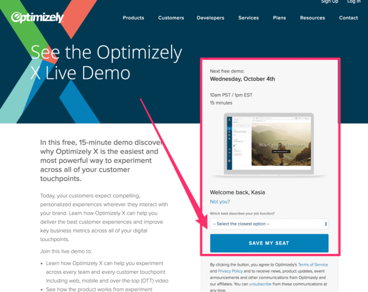
Credits: Optimizely
5. Social Sharing Buttons
Social sharing buttons are quite popular CTAs used by most blogs. Their task is to maximize the shareability of your content. They let people distribute your publications and make the process of distribution as easy as it gets.
This usually looks like this:
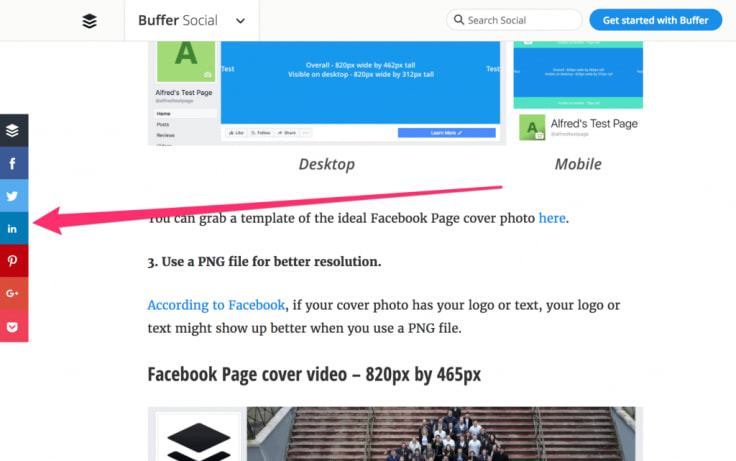
Credits: Buffer
No matter how far down you scroll, the floating bar keeps you company and allows you to share a given resource whenever you like. When you start reading when you’re in the middle, or once you finish your read. It’s right there, ready to get clicked.
Ok, so these are the 5 major types of CTAs that can be seen online. Have I missed something? If that’s the case, let me know. 😉
And what about you? Are your CTAs efficiently capturing people’s attention?
Be mindful about tons of factors that come into play and affect the conversion of CTA:
6. Tips for a Killer Call-to-Action
1. Place a Strong Command
As we’ve already stated at the beginning of this article, a call to action is supposed to make your users want to do something. This means, making it actionable and attention-grabbing is critical for its optimal performance.
That’s why you should use a strong command, be clear and concise about the action you are prompting. Get to the point immediately, especially that you don’t have too much space ;-). It’s best to start your CTA copy with the desired action.
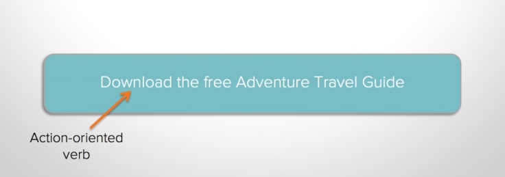
In practice, it looks like this. Take a look at the beautiful and so simple example provided by Wix.

Credits: Wix
2. Leverage Power Words
Always try to fit in emotional (power) words into your CTA to provoke enthusiasm and help you persuade your prospects better.
Let’s paraphrase Animal Farm:
All words are equal, but some words are more equal than others.
And this is a simple fact.
Some words hold more sway over decision-making process than others.
Once you pose a strong command make sure it isn’t neutral to your audience. Neutral is the worst impression that you can make because it usually translates to no impression at all.
The highest response usually comes from emotions both positive and negative. Interestingly, researchers confirm that negative emotions bring in even better performance compared to positive ones.
Pro tip: Marketers recommend a small yet efficient tweak: use an exclamation point at the end of your CTA copy!
3. Play the Game of Benefits
Another tweak to implement while formulating a well-performing CTAs is to adopt the visitor’s point of view and use the language of benefits that matter to them. Make sure you don’t speak about yourself in your online resources. Nobody cares about you, people care about themselves
Think: what’s in it for your users.
Look into the key selling points of a given product that you happen to market.
No matter if you are targeting people who struggle to find a job, lose weight, become rich or achieve success through e-commerce, always get straight to the point.
And this refers especially, to your CTA’s as they have exceptional power because they are gateways from one stage to another on your conversion path.
4. Short forms, if any
Submitting a form is one type of CTA. As mentioned a few paragraphs above, such CTAs are usually located on landing pages offering marketing offers for download. That’s the first stage of a conversion process – just before your website visitor becomes your lead.
Such forms shouldn’t require responding to a lot of questions.
Don’t ask redundant stuff, just several things that are necessary to establish this initial and most essential connection. At this point, asking too many questions is a deal breaker and will discourage users from filling out your form.
All in all, you’ll have time to ask your additional questions sooner or later if a visitor converts.
Focus on getting the basic contact information that is just necessary to start the proper personalized communication.
5. Make it Belong
Your CTA button should be compelling and relevant to the whole content of your landing page. Plug into it same keywords and language that appears in the landing page’s copy. Match them.
A call to action should be an integral part of your landing page. Make sure the landing page’s copy is fully optimized for CTA and that the CTA is a natural extension of the contents.
Everything here is of significance. The landing page’s structure, the design, fonts and colors, visuals used, content and the button itself have to be integrated.
Remember to make CTAs look like they belong and are not forced onto the page. At this point, your visitors are so close to converting into leads that you can’t ruin this job done with lackluster submit button copy.
6. Colors and Conversions
How does this color pertain to the performance of your call to action? How does it fit in with the overall landing page palette?
Unamo
When wavelengths of light reach the retina, they get converted into electrical impulses and sent to the hypothalamus, the part of our brain that releases hormones that affect behavior. Essentially color, similar to the foods you eat, affects the hormones that get released in the human body.
So there is something about colors that affects us psychologically.
We often react subconsciously to things that come to our senses. Affected by what we see, smell, hear or feel. That’s the beauty of science and human biology. We can’t control this part of our brain, this makes us prone to persuasion.
That’s why we can base marketing on stimulating our subconscious minds. But a given color alone doesn’t yield out any specific reaction that may translate to conversion.
A single color matter in a bigger perspective. The whole palette of your landing page and its background together are of significance. Everything on your page needs to be visually appealing and also represent your brand. It takes smarts to match the colors, images, fonts, content, and buttons into one fully-optimized masterpiece.
Applying contrasting colors to your CTAs has a distinct role in making it stand out. And we should care to make it stand out with color as much as it’s possible.
7. Placement Matters
Also, pay attention to the right placement and size of the CTA. Make sure each single aspect of your CTA optimization is well-tested.
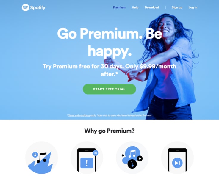
Take a look at this screengrab from Spotify landing page. Besides beautiful colors and a picture of the dancing girl listening to music and enjoying the app, there is a CTA that is centered. It stands out beautifully, but also belongs to the page – even though it’s copy is direct and well-worn. This is exactly what are talking about – expressing directly what action is intended on this page.
We can say that Spotify meets all the CTA optimization requirements so this is a blueprint you can follow while optimizing your buttons.
Back to you
Each, even the slightest change you apply to your CTA should be tested thoroughly. Always compare the performance before and after a single enhancement has been implemented. Moreover, always test one change at a time. Otherwise, you won’t know which single enhancement caused the boost. Take all these tips and go back to your online resources to apply optimizations and check out what your CTAs look like.
If you got any comments or want to talk things further get in touch with me via TT.
Happy Marketing guys! ✌️