Showing top 0 results 0 results found
Showing top 0 results 0 results found

We all want more traffic, but we also all want to convert visitors into users, subscribers, and customers. Optimizing your clients’ website for conversion is a big topic and something you will want to discuss and define with them. However, these are some catch-all things every developer, designer, or store owner can do to ensure a well-converting site for themselves or their clients.
So, let’s jump right in!
1. Check page speed for delays
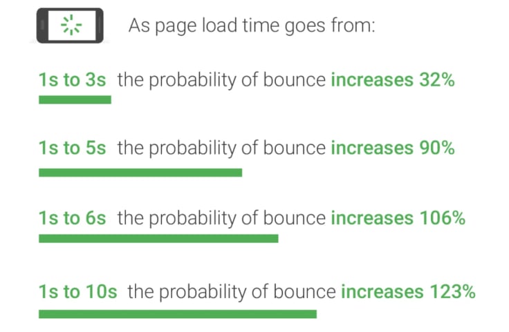
The longer the page speed, the higher the bounce rate. You might think a couple extra moments of waiting won’t matter too much, but according to a study done by Blue Corona, a mere 1 second delay in your page speed will result in losing 11% of your page views and 7% of your conversions rate.
Also, here is further proof provided by ThinkWithGoogle that the longer the load time, the higher your bounce rate will be:
Here are some questions to ask yourself why the site you’re working on might be lagging:
- Have your images been optimized?
Compressing or cropping your images is a great way to make them more “load-friendly”. You can do this on sites such as Fotor or even Canva if you already have an account.
- Do you have lazy loading implemented?
Lazy loading means that visible content will be prioritized when loading. This reduces the initial page load time and the initial page weight. To implement lazy loading on your images on newer browsers, you can simply add “loading” to the image attributions in your backend. For older browsers, you will have to add it to your Javascript.
- Are you utilizing a CDN?
A Content Delivery Network (CDN) is a system which allows you to essentially store your site data on another server to your own, so that visitors from around the globe can access your site faster, because the CDN closest to them will be serving it to them.
- Do you have a script you don’t need?
Access script will add to your page weight and initial load time. Minimizing unnecessary script will boost your page speed. So make sure to do a periodic clean up on your client’s site, so it runs smoothly.
- Are your plugins lightweight?
To check which of your plugins might be slowing your client’s site, first test the speed on a site like Pingdom. Then deactivate the plugin you suspect might be the root of the lag and see if the page loading time speeds up. Repeat this until you find a culprit. Search for lightweight alternatives, if necessary.
2. Check for browser and device compatibility
The last thing you need is to work tirelessly on perfecting a store for your client and thinking you are just about done, only to realize it’s a hot mess when you visit the site on a mobile or a different browser. It is so important to check your website on different devices to make sure all your users are seeing the best version of your website.
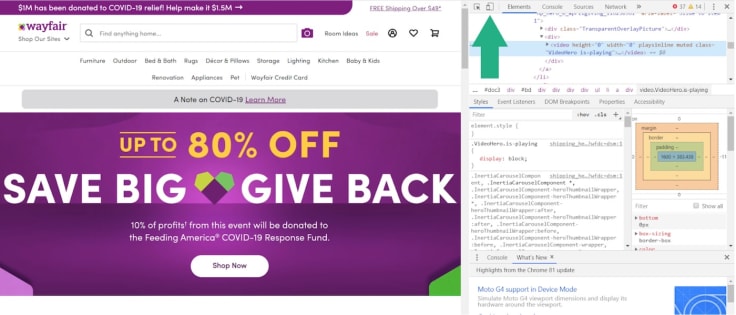
To test your mobile and tablet optimization, you can use Google Chrome's "Inspect" function. ([Ctrl+Shift+I] on Windows and [Option + Command + I] on Mac)
Switch to mobile responsive mode (shown below) to really test the mobile view of your site design. Sometimes the mobile preview mode on your website editing software is not enough.
Other common web browsers offer similar functionality.
3. Check for UX design issues
UX stands for user experience, and UX designing is incredibly important when it comes to optimizing your store for conversions. UX design done well will minimize any obstacles between the user and what you want them to do next.
Common UX design mistakes include:
- Having too many CTAs: have one objective for each page on your site. (see tip 4)
- Not being mobile-first: make sure you test your site and layout on all devices. (see tip 2)
- Huge menus: menu drop-downs covering the whole page, especially on mobile is a common design flaw. Don’t try to fit an entire desktop menu onto your mobile screen, less is definitely more.
- Not having easy access to customer support: Having a chat option, such as LiveChat, available and accessible on your website with a real person responding undoubtedly adds to the experience of the user. The potential customer can rest assured knowing that any issues they may have will be addressed immediately.
4. Check for optimized CTAs
CTAs are important because they are the bridge between where your users are and where you want them to be. This step must not be underestimated. Studies have shown how minute changes in the wording, placement, shape, and color can have a significant impact on conversions.
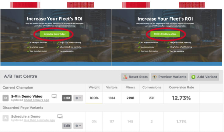
A case study by Moz shows us how reducing any friction was all that was needed for conversions to go up. They ran a test on a landing page offering a demo to users which they thought wasn’t converting well.
Through A/B testing, they found that the word “schedule” was the issue. It added an extra layer of work the user needed to do before receiving the value the website was offering through the demo. So they changed the CTA copy from “Schedule a Demo Today!” to “FREE 5-Min Demo Video”, shifting the focus from added work to a promise of value. The conversion rate of the CTA went from 1.71% to 12.73%.
Here are some tips on optimizing your CTAs:
- Keep it relevant.
- Focus on the value offered.
- Use contrasting colors.
- Utilize your brand voice.
5. Check for appropriate social proof
The final tip for boosting the conversions on your clients’ website is making sure that they have the appropriate social proof included on their page. Social proof is the idea that people are influenced by the behaviors of others. For example, if a new user is coming to your website and is unsure of whether the site and store are secure and reputable, seeing proof of others' interest in your store is a great way to assure them.
Social proof can also ignite a fear of missing out on an experience others have enjoyed. It also works to reaffirm their own interest in your product or service.
There are many different ways to use social proof, for example:
- Ratings and Reviews
- Showcasing user-generated content
- Utilizing a “People also viewed” feature
- Displaying likes and shares of products
- Showing social media comments, likes, followers, and shares
- Utilizing influencer marketing
- Sharing expert endorsement and testimonials
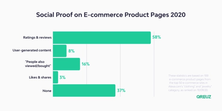
Qreuz did a study of social proof on 100 of the top e-commerce sites in 2020 and found that including ratings and reviews was the most popular form of social proof used. BrightLocal found that 88% of consumers trust online reviews as much as personal recommendations.
Let’s Roundup!
Building a store is not easy and making one which is set for conversion success is even harder, but the extra time and effort it may take is worth it. Let’s recap the main takeaways from this article:
- A faster load time will reduce bounce rates.
- A site compatible with all devices and browsers will leave a great impression on all your target market, no matter how they surf.
- A seamless user experience will guide prospects through your conversion funnel.
- The perfect CTA does exist!
- The right social proof will build great trust between your client and their users.
I hope this list helps you give your clients a website you are confident in. What other conversion boosting tips would you add to this list?
I’d love to learn from your experience!


