Showing top 0 results 0 results found
Showing top 0 results 0 results found

Once we’ve provided you with guides about writing headlines and optimizing CTAs, I realized this calls for supplementing it with another tutorial. This time on landing page optimization.
All in all, conversion rate optimization is an essential topic for online marketers of all kinds and such method of optimization should be used at each stage of the marketing funnel. This also refers to each activity you, as a marketer, undertake.
Using analytics and user feedback for improving your marketing results is the only right approach to online marketing. If you strive for success, you have no choice but to follow the data.
So today, we’ll teach you how to create a landing page that is both well-optimized and high-converting.
What is a landing page
A landing page is usually a standalone web page an internet user lands on straight from the search result page or an ad. Often, you link to landing pages from blog posts, advertisements, or emails to maximize organic traffic and seize the opportunity for conversion.
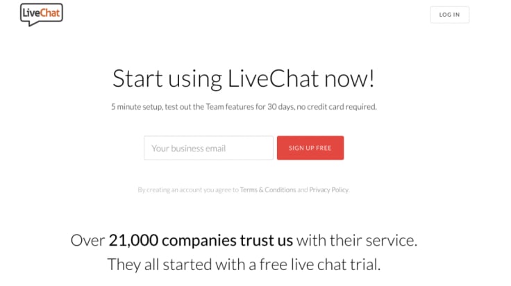
A landing page actively contributes to conversion rate optimization. That’s why it should be focused on a single goal and well-optimized for maximal performance.
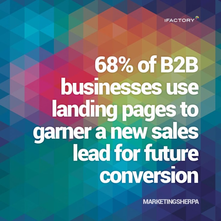
When designing high-converting landing pages, you should remember their primary goal of converting visitors to leads. However, there are more best practices you should stick to while creating your landing pages. Let's’ start from the beginning.
1. The headline of your landing page
As you already know from headline writing masterclass, without a proper headline, your content will remain unnoticed, so it might as well not exist.
Headline writing can literally make or break your marketing deal since it defines the performance of a given page.
The headline is the first and one of most critical elements of your landing page. It attracts searchers to your resources and convinces them to pick your offer from the sea of others. It’s also one of the easiest ingredients of a landing page to tweak and get a noticeable boost immediately.
That’s why you should think about it for a while and even create several titles and test their efficiency.
A headline is the first thing your visitor reads on your landing page, this is why you should make sure it compels users to take a closer look at your marketing offer and convince them to read on.
A good landing page’s headline should:
- drive user’s attention,
- be brief and to the point,
- summarize the whole landing page’s copy,
- and express the core benefit directly, so users can expect what exactly comes in further,
- match the ad or blog post-CTA message visitors clicked to get there.
As Wordstream reports, headlines don’t have to be unique or express the astonishing level of freshness and creativity, they just need to follow some successful patterns.
Contrary to popular belief, the best marketing isn’t always the most creative - Wordstream
Long story short, Wordstream refers to an interesting anecdote from the excellent book Made to Stick and the study conducted by Israeli researchers.
The outcomes of this research are quite shocking. Namely, the most successful ads followed the same basic templates, while the losers happened to be most unique and creative among the others.
This gives us something for consideration. While the whopping majority of online marketers struggle each day to bring in fresh levels of creativity to their job, it turns out that it’s not exactly about being unique. In this business, it’s all about bringing results to the table. And this comes down to analytics rather than anything else.
It’s actually great news to me, it means that it’s enough to identify some well-performing patterns, rework them and apply to your future campaigns.
So what exactly works? Get back to the Headline Writing Masterclass and see for yourself what the best headline formulas out there are and what’s important to look after.
There are also free tools like Portent’s Title Maker, Sumo’s Headline Generator, and CoSchedule’s Headline Analyzer can be incredibly helpful at formulating successful headlines.
2. Copy of Your Landing Page
There’s an art to writing GREAT content for landing pages!
You need the experience to know how to balance between what is concise, attention-grabbing landing page copy and when you go too far. It’s all about using the right voice and being smart at translating product features into benefits. Crafting copy that works demands you understand techniques that are at play, are able to rework them and adapt to your own environment.
Fortunately, this skill can be mastered in the game of constant testing. And trust me, that’s the fun part!
Improving your results a bit before you finally get optimal outcomes brings satisfaction. You see you are learning and making progress.
It’s often a game of subtle influence. Like using power words where applicable.
Therefore, to become a conversion pro, you should continually study the decision-making process of your buyers and learn some psychology of marketing. Then, leverage this knowledge in crafting high-converting copy for landing pages.
Grammatically Perfect
Perhaps this sounds obvious to you, but from my own experience, I can tell you that grammar is quite challenging.
Although we can say it’s the most basic thing for each copywriter to master, in fact, it’s often neglected. And it’s an issue, especially, when we speak of companies that come from non-English speaking countries.
Side note: Trust us. We try double hard to get our English right. So, uhm, guys? Don’t make it extra hard for us and submit proofread guest posts!
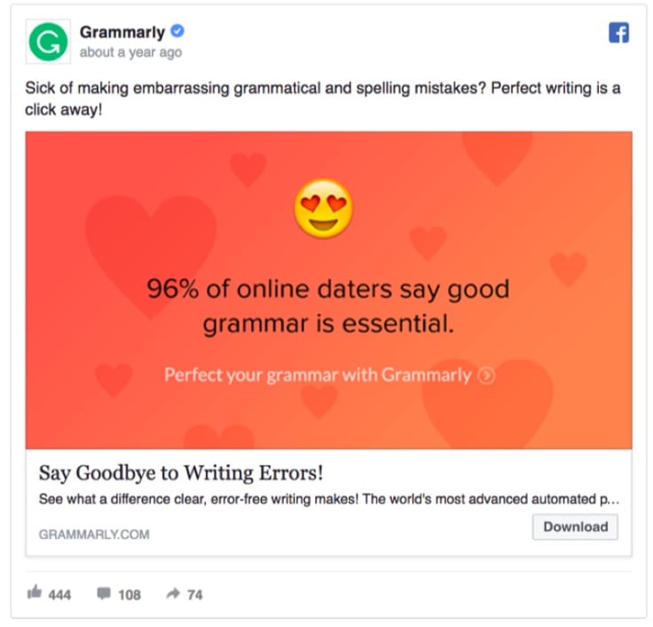
That’s right.
Proper grammar is essential not only for daters though, so make sure you have it under control, and it’s flawless. ;-)
For instance, if you target English-speaking countries, make sure your English is grammatically perfect before you release any single landing page or article. Otherwise, native speakers will quickly notice your flaws, and this will ruin your standing in the given field. Users will picture you in a dunce cap.
So to begin with: Grammar should be your religion and “Thou shalt proofread” your first commandment.
Give up on being Formal {= Boring}
Next, don’t be afraid to get slightly informal and even funny in your landing page copy.
Specifically, in English, it’s natural to be direct and to use a friendly tone. Tossing in a word or two you would typically use if you were hanging out with buddies is fair game. Influencers and marketing experts do it.
Just take a look at content produced by Ramit Sethi, the New York Times bestselling author of "I Will Teach You To Be Rich". I have to admit that he is an excellent writer and I really enjoy the lightness that he brings in.
Rework it and do something in a similar style. Make your message joyful and bring in some lightness into your copy, exceptionally, when shaping an efficient landing page.
3. Simplify Your Content
Fine, flawless grammar. That’s an obligatory attribute of any powerful landing page. Being casual, too - that lets everybody feel at home.
There is also another fundamental need - the need for simplicity.
Landing pages must be significantly simplified regarding copy and design to drive the right focus in the right direction. Any distractions that may drive users attention away should be avoided so that the opportunity for conversion is maximized
In fact, landing page content has a specific purpose, and this purpose is to support the CTA message. Besides, content changes can be a quick tweak and an easy conversion booster if done correctly. Since simplicity is the highest form of sophistication, you should always put it first.
When formulating your landing page’s copy:
- use simple words,
- limit the word count - a shorter copy is stronger and has a more significant impact on your audience,
- build short and uncomplicated sentences,
- get to the point,
- support the message your call-to-action conveys,
- avoid complex structures,
- Use numbers, bullets and bolding where possible to make your content more digestible.
Make simplicity one of your strengths.
As a matter of fact, people want to know precisely what your landing page is about and what exact action they are expected to take on a page. Wordplay won't bring you any extra leads. This is why you’d better talk clearly, concisely and directly to your prospects. Otherwise, they can get easily confused. Once they lose the point of what they are doing on a landing page - they will abandon your card.
*One thing that you can do apart from simplifying your landing page copy is to tweak it by power words and thus making it more persuasive.
4. Landing Pages Forms
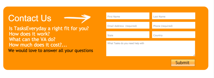
Typically, landing pages come with forms.
Credits: CrazyEgg
And such forms have a clear purpose of collecting contact information from visitors.
This is one of two expected actions on a landing page. The second one is usually clicking on the CTA button. However, many online marketers still get forms wrong. Part of them make their forms too long - they ask about too many things and discourage people from filling them out.
And others ask too few questions, and they’re missing out big time since they are unable to qualify those visitors efficiently as worthwhile leads even though they convert.
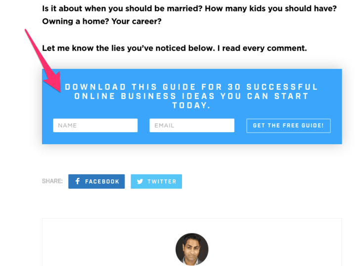
Most companies tend to ask for redundant information, of course, some of them are essential to segment a lead correctly and direct a right communication at them. However, all possible questions don’t need to be asked all at once. Remember, once a visitor becomes your lead, the inbound communication starts, so this is just beginning, and you have still chance to ask your further questions later on.
Credits: Ramit Sethi
Initially, you just need to learn the vitals about your new-coming leads like their name, optionally - surname, and email address. That’s a good start.
5. Embrace Benefits
Technically, it’s about copy, but using benefits is so important that it’s worth writing a separate paragraph about it.
When crafting your landing page copy, it’s essential that you turn the features of a given product into client benefits. Think of unique selling points of products which you promote and consider what benefits they bring.
Then use these profits in your product description.
6. Bring in Testimonials
Another key factor that should find it's placed on a high-converting landing page are testimonials.
Make sure you always fit testimonials into your layout as this is your social proof and the chance to confirm that your product is an excellent choice because it’s actually helping people and delivering on the promises.
LiveChat
Testimonials create a unique opportunity to validate your product (or service quality). People trust in them, don’t miss out on their potential.
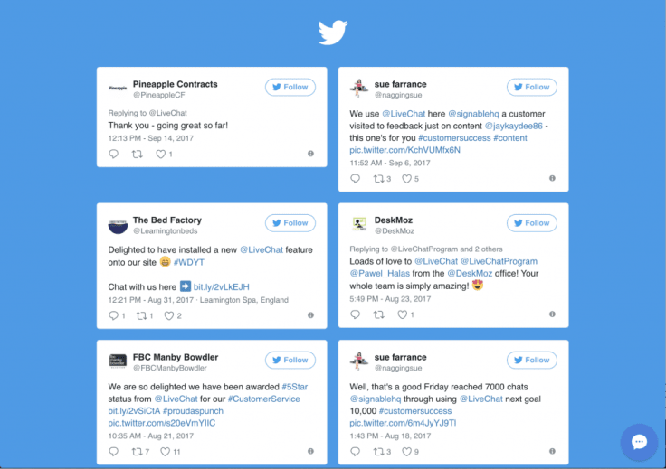
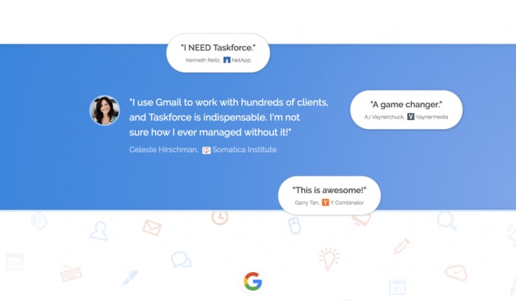
Testimonials can come up on your landing page in the form of the embedded tweet; Twitter card, or can be a quote with author and his headshot included.
Credits: Taskforce
You can expose, for instance, an authoritative figure that happens to use your product - and of course has something good to say about your business - or present the plethora of well-established and highly-recognized companies that are included in your customer base.
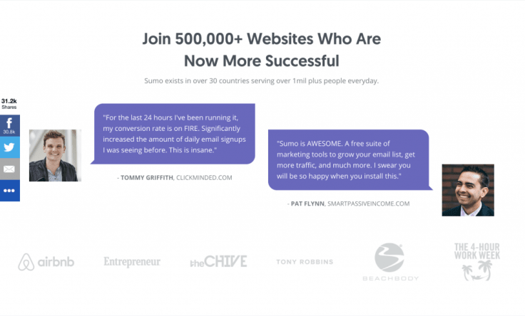
Credits: Sumo
Another formula for testimonials that can take your landing page to the next level is including an excerpt from a case study on it. Companies oftentimes base the whole landing page’s layout on this form of social proof and even wrap the entire content around it and put a case study centered.
7. Release your numbers and let them speak out
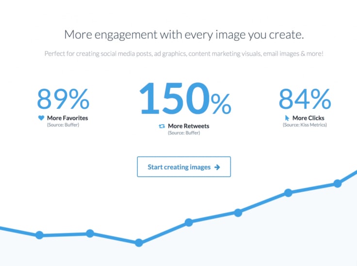
The next idea for social proof on your landing pages is taking the transparent approach and exposing your results, achievements and company data. Let them speak to your prospect imagination.
Astonishing results will delight users and enhance the impression your landing page makes. Prospect will instantly see you as a successful company that enjoys global trust and loyalty around the world (if your product is global)
If you can boast about numbers, don’t hesitate and put them first. They will work to your advantage.
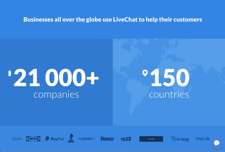
LiveChat
Credits: Stencil
8. Visuals
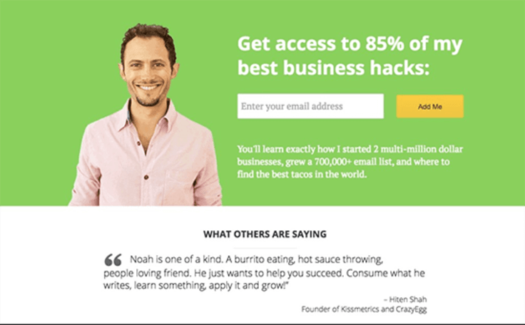
What about visuals for landing pages? They build up the emotional foundation of your landing pages and help you visually communicate the value of your offer.
Visuals have a superpower to express a lot of things at once in a nonverbal way and communicate your offer much quicker than your visitor can actually read. This makes them helpful once you are trying to convey a specific message.
There are lots of ways to use visuals and images are just one type of them. Other include videos, gifs, product presentation and use case, and abstract print backgrounds to apply. What’s best for your landing page?
Well, it all depends on what you are trying to show and what impression to make.
Your visuals can capture attention and make the whole landing page have a vibe like these:
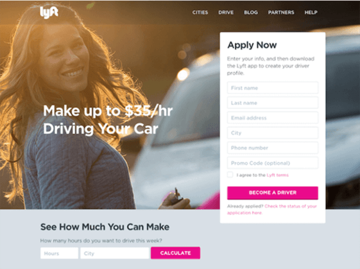
Credits: Lyft
Credits: Noah Kagen OkDork
No matter what form of visuals you decide to present on your site, make sure they are all high quality, and at the same time they aren’t too heavy and won’t ruin your page load speed.
If you can use video over images. It’s been shown to improve conversion by up to 80%. It’s because visitors are likely to spend more time on your page when they are engaged in some passive activities such as watching a video that, in fact, is easier than reading. And this additional time works for your favor.
Creating videos for your landing pages make sure you have something important to show in it, and the video is of the highest quality.
Experiment with different media types. You can always create two versions and look what outperforms the other.
Above all, remember that every element of your page should be aligned conceptually with the topic and goal of the page.
9. Call to action
In the last write up, we’ve discussed what CTA is and how it relates to the conversion process. Learn the details of creating a call-to-action that works like a charm by reading our last article.
Let’s just outline the essential practices of using CTA’s on landing pages:
- make your CTA prominent and visible above the fold,
- its message should be brief, actionable and clear,
- ensure that your CTA is centered on your landing page, all the other elements support it, direct to it and focus on it. You can even add a background presenting people who look at it or even point at your button.
10. General Landing Page Tips
Now it’s time to share some general rules of landing page structure.
The landing page should focus on a single, primary goal. This is why you should keep all the possible distractions limited to a minimum. This is why we resign from placing navigation on a landing page and rather avoid adding links. Instead, we should enable social sharing, so visitors hooked on your offer can bring other potential prospects to it.
Above the all, remember about testing. This is the only way to figure out what works for your individual case.
That’s why you add one tweak at a time and see what difference it yields. To streamline the testing process, it is a good idea to segment your traffic sources. Create separate landing pages for PPC, email, social media, organic and banner campaign. This way you will be able to track your conversions by channel and observe what channel performs best.
You can also check these landing page conversion tips from Poptin's Gal Dubinski.
Ok, so we’ve covered all the vital elements of a landing page. How do you like my guide? Get in touch with me via Twitter.
Happy marketing!
Kasia


