Showing top 0 results 0 results found
Showing top 0 results 0 results found

Are you getting plenty of website visitors but no conversions? Frustrated by high bounce rates and abandoned carts? You’ve put in all that work to drive traffic, but the sales, sign-ups, or leads just aren’t matching up.
Here’s the thing: an average website conversion rate is around 2.35%, but the top 10% of companies are converting at over 11.45%. What’s their secret? They’ve cracked the code on turning casual visitors into loyal customers. The good news? You can, too.
With the right strategies, you can transform clicks into sales and maximize the value of every visitor. Here, I’ll walk you through 10 proven strategies that work (backed by real-life examples) to transform your website into a conversion powerhouse.
Ready to stop losing leads and start winning customers? Let’s dive in!
What is conversion rate optimization? Why it matters?
Conversion rate optimization (CRO) is the process of improving your website or landing page to increase the percentage of visitors who complete a desired action. Whether making a purchase, signing up for a newsletter, or filling out a contact form, CRO is about turning visitors into customers.
CRO matters because it directly impacts your bottom line. You can drive all the traffic to your site, but if those visitors aren’t converting, you’re leaving money on the table.
By optimizing your conversion rate, you get more value from the same amount of traffic, making your marketing efforts more efficient and cost-effective. It's the difference between just having visitors and turning those visitors into loyal customers.
For example:
Imagine spending $10,000 monthly on a PPC campaign at a $5 cost per click (CPC). And you’re getting 2,000 clicks each month.
Let’s say your landing page has a 2% conversion rate. That’s just a bit below the industry average of 4.3%.
If we do the math:
- 2,000 clicks per month = 40 leads
- That’s a cost of $250 per lead.
But what if you could boost your conversion rate to 5%? Let’s check it out:
- 2,000 clicks per month = 100 leads
- Now, your cost per lead drops to $100.
See how powerful that is? With the same budget, you can get 2.5 times more leads just by increasing your conversion rate. A huge win!
Looking for other ways to increase your earnings?
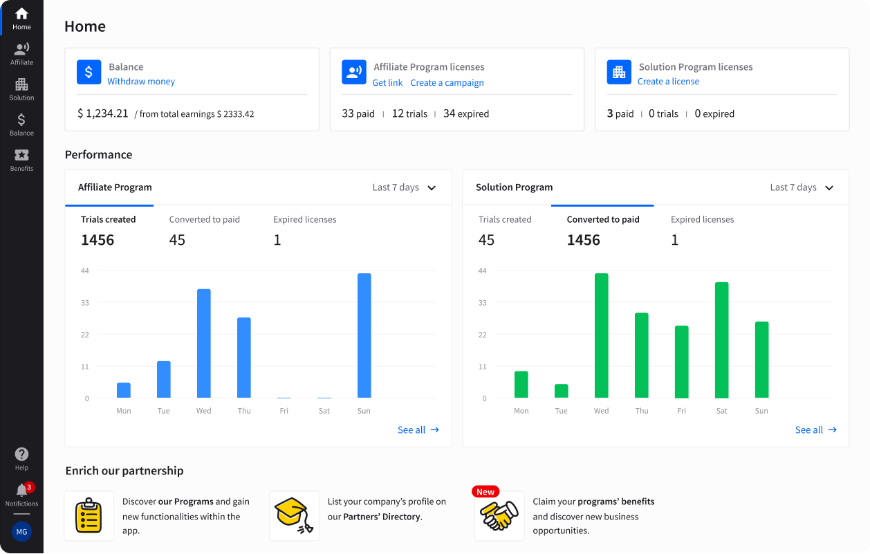
Become our affiliate partner or a solution provider and discover new revenue streams!
The plan of action to increase your conversion rate
To boost your conversion rate, you need a solid plan. From optimizing your landing pages to A/B testing different elements, every action you take should be data-driven and purposeful.
Start with the basics: Understand your customers and goals
Before diving into fancy optimization strategies, getting the basics right is important. You can’t optimize for conversions if you don’t know what success looks like.
Are you aiming for more product sales, sign-ups, or downloads? Defining clear goals for your site makes it easier to measure whether your efforts are actually moving the needle.
Start by identifying what a “conversion” means for your business. It’s not always about sales. For some, submitting a lead form or signing up for a newsletter is a win.
Once you have a goal, it’s time to take a good look at your website’s performance. Don’t just guess what’s working and what’s not—use data. Analytics tools like Google Analytics or Semrush can give you a clear picture of what’s happening behind the scenes.
- Traffic sources: Where are your visitors coming from? Knowing whether they’re coming from organic search, social media, or paid ads helps you tailor your approach.
- Bounce rate and exit pages: If you see a high bounce rate on a particular page or visitors exiting right before converting, something’s wrong. You need to dig deeper and figure out what’s causing friction.
- Conversion funnel: Set up conversion funnels in your analytics tools to see where visitors drop off. This will help you pinpoint where to focus your optimization efforts.
Review your site’s friction points
It’s easy to overlook, but friction points on your website could be the main reason you’re not converting. These are the areas where visitors get stuck or frustrated and leave before completing the desired action.
- Slow loading times: A slow site can drive visitors away faster than anything else. According to a Google study, a delay of just 1 second in load time can reduce conversions by 7%.
- Complicated forms: Do your forms feel like a chore? Long forms with too many fields can cause users to abandon before submitting. Keep it simple—ask only for the essentials.
- Cluttered design: A cluttered, overwhelming layout can make visitors feel lost. Ensure your pages are clean, visually appealing, and easy to navigate.
If your visitors encounter these friction points, your conversions will suffer. The key is to regularly test and improve these areas based on data, feedback, and your overall goals.
To do so, let's explore some conversion rate optimization strategies.
1. Highlight your unique value proposition
When visitors land on your website, you have just a few seconds to grab their attention and convince them to stay. Your unique value proposition (UVP) must be front and center—above the fold. This area of your site is visible without scrolling, making it prime real estate for showcasing what sets you apart.
Your UVP is essentially the answer to this question: Why should someone choose your product or service over others? It highlights your specific benefits and how they solve a visitor's problem. If this isn’t crystal clear right away, visitors might lose interest and click away.
First impressions count, and most users don’t scroll unless they find something compelling right away. Putting your UVP above the fold ensures that everyone who lands on your page immediately understands your offering and its value.
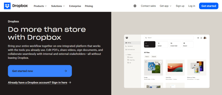
For example, consider Dropbox. Their UVP is simple and clear: “Do more than store with Dropbox.” This statement is prominently placed on their page, along with details and a call-to-action button to get started. Visitors instantly know what Dropbox offers and how it can benefit them.
Your UVP should be concise, specific, and focused on the customer’s needs. Here’s how you can nail it:
- Customer's pain points
Highlight the problem your product or service solves. For example, if you’re selling time management software, your UVP might focus on helping people do more in less time. - Focus on benefits, not features
Customers care about how your product will improve their lives. Instead of listing technical specs, emphasize outcomes like saving time, reducing costs, or improving convenience. - Use a strong headline and subheadline
Your UVP should include a bold, attention-grabbing headline paired with a short subheadline that provides additional context. For example, “Stay Organized with Ease” followed by “Our app helps busy professionals manage their schedules effortlessly.” - Make it visual
Pair your UVP with visuals that reinforce your message. This could be a product image, a happy customer, or even a short video showcasing your solution.
By prominently placing your UVP, you immediately connect with your audience. They’ll know exactly what you offer, why it matters, and why they should stick around to learn more.
2. Leverage social proof
Social proof is one of the most effective tools for boosting conversions. It’s a psychological phenomenon where people look to others’ actions or opinions to guide their decisions. Think about it: when was the last time you booked a hotel or bought a product without checking reviews first?
We naturally trust the experiences of others. Visitors seeing positive reviews, testimonials, or impressive user stats creates a sense of credibility and reduces the fear of making a bad decision.
In fact, research shows that 92% of people trust recommendations from others, even if they don’t know them personally. That’s the power of social proof.
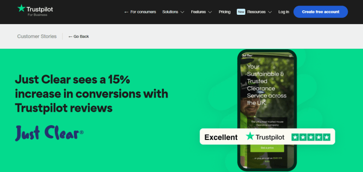
A great example is a SaaS company that partnered with Trustpilot to collect and display customer reviews on their website. Prominently showcasing their ratings increased their conversion rate by 15%. Seeing hundreds of glowing reviews made potential customers more confident in buying.
Here are a few proven ways to incorporate social proof into your website or landing pages:
- Customer testimonials
Highlight genuine reviews or success stories from satisfied customers. Place them near your call-to-action or on key landing pages where visitors might hesitate. Pro tip: Include a photo or full name for added authenticity. - Trust badges and certifications
Display security badges (like “Verified by [name]”) or certifications from recognized authorities. For example, an "Award-Winning Service" badge can boost confidence instantly. - Impressive user statistics
Numbers speak louder than words. Use stats like “10,000 happy customers” or “Rated #1 by 95% of users” to show how many others trust your brand.
By strategically integrating social proof, you create a positive ripple effect. Visitors feel reassured by others’ experiences and are likelier to take the leap and convert. It's a simple yet powerful way to build trust and close the gap between interest and action.
3. Prioritize mobile optimization
With mobile devices now accounting for more than half of all web traffic, mobile optimization isn’t just a “nice-to-have.” It’s a must.
Visitors expect smooth, seamless experiences on their phones, and if your website falls short, they’re likely to leave. Google also prioritizes mobile-friendly sites in search rankings, so ignoring this shift could hurt your visibility and conversions.
Mobile users are often on the go, looking for quick answers or easy purchases. If your site isn’t optimized for smaller screens, you’re creating friction that could cost you sales. Slow load times, clunky navigation, or text that's too tiny to read can frustrate visitors, driving them straight to your competitors.
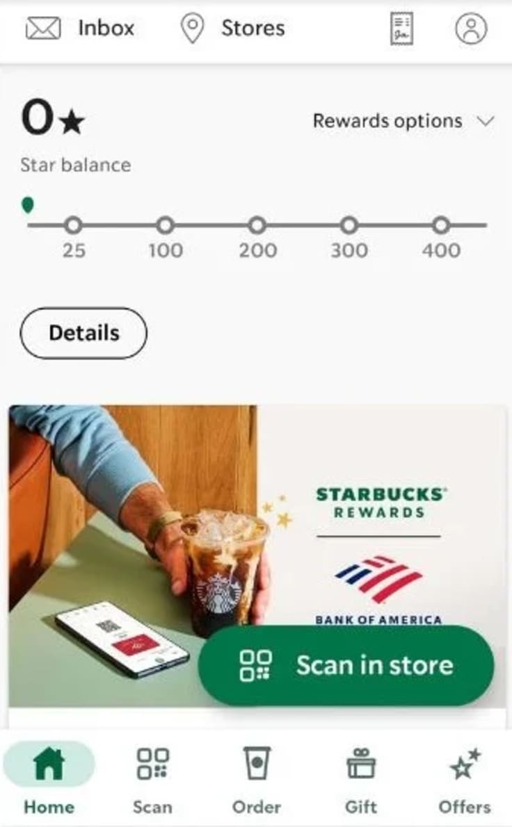
Take Starbucks, for instance. Their mobile-optimized rewards app has become a key revenue driver. By making it easy for customers to order ahead, collect points, and redeem rewards, all from their phones, they’ve significantly boosted app sales and customer engagement. The app’s streamlined design and fast load times are perfect for busy, mobile-first users.
Some best practices that you can adopt include:
- Responsive design
A responsive website automatically adjusts to fit any screen size, ensuring your content looks great and functions well, whether viewed on a phone, tablet, or desktop. Test your pages across devices to confirm they’re fully responsive. - Optimize page load speeds
Speed is everything on mobile. If your page takes over three seconds to load, over half of users will abandon it. Compress images, enable caching, and minimize JavaScript to keep your site fast and efficient. - Simplify navigation
Mobile users want simplicity. Use clear menus, large buttons, and intuitive layouts to make it easy for visitors to find what they need. A clutter-free design ensures they can complete actions, like purchasing or signing up, without frustration.
Prioritizing mobile optimization is about meeting users where they are. Creating an effortless experience for visitors’ll improve their satisfaction and boost your conversion rates.
4. Create high-converting CTAs
Your call-to-action (CTA) is like a signpost directing visitors to take the next step, whether it’s signing up, purchasing, or downloading a resource. A clear, compelling CTA can make or break your conversion rate. It’s not just about throwing a button on the page. It’s about designing a button that motivates action.
CTAs are often the final nudge your visitors need. If they’re unclear, bland, or poorly placed, you risk losing potential customers who are otherwise ready to convert. The best CTAs grab attention and inspire urgency, creating a sense of “I need to do this now.”
To do so:
- Use strong, action-oriented verbs
Don’t leave visitors guessing. Phrases like “Download Now,” “Start Your Free Trial,” or “Join Today” tell users exactly what to do. The more direct, the better. - Create a sense of urgency
Give visitors a reason to act now, not later. Add phrases like “Limited Time Offer,” “Sign Up Before It’s Gone,” or “Only 5 Spots Left.” Urgency creates FOMO (fear of missing out), pushing hesitant users over the edge. - Strategically place CTAs
Your CTAs need to be easy to find. Place them:Above the fold for instant visibility. - At the end of compelling content (like a blog post or product description).
- On exit-intent popups to capture leaving visitors.
- Make CTAs visually stand out
Use contrasting colors to make your CTA button pop against the page background. Combine it with clear, readable fonts to grab attention. - Test and optimize continuously
A/B test your CTAs. Experiment with button colors, text, size, and placement to find what resonates with your audience.
Bonus Tip: Personalize CTAs when possible. A CTA like “Start Your Journey to Better Marketing” feels more tailored than “Learn More.”
By focusing on clear, action-oriented CTAs, you turn indecision into action. These small but mighty buttons are the bridge between curiosity and conversion. Don’t underestimate their power!
5. Simplify your checkout process
A complicated checkout page is one of the biggest reasons for cart abandonment. Imagine spending time browsing and adding items to your cart, only to face a long, confusing, or clunky checkout process.
Frustrating, right? That’s exactly how your customers feel. And many of them leave without completing their purchase.
In fact, studies show that the average cart abandonment rate across industries is nearly 70%. One of the leading causes is too many steps or unnecessary barriers during checkout. Simplifying this process is essential to keeping customers moving toward that final “Place Order” button.
To simplify your checkout process:
- Guest checkout
Forcing users to create an account before purchasing is a major roadblock. Some customers just want a quick, no-strings-attached shopping experience. Offering a guest checkout option keeps things simple and removes friction. - Minimize form fields
No one wants to fill out endless forms. Only ask for essential information, such as name, shipping address, payment details, and contact info. Skip unnecessary fields or make them optional. - Provide multiple payment options
Different customers prefer different payment methods. Offering options like credit/debit cards and digital wallets (PayPal, Apple Pay, Google Pay) ensures everyone has a convenient way to pay. - Show a progress indicator
Let customers see how far they are in the checkout process. A simple progress bar reassures them that they’re almost done, reducing drop-off rates. - Optimize for mobile
With many users shopping on their phones, your checkout process must be mobile-friendly. Ensure forms are easy to fill out, buttons are large enough to tap, and payment options integrate seamlessly on smaller screens.
A streamlined checkout process isn’t just about convenience. It’s about retaining sales. By removing unnecessary hurdles and making it easy for customers to complete their purchases, you’ll see fewer abandoned carts and more happy shoppers.
6. Improve page load speeds
Did you know that a slow-loading website could be costing you customers? Page load speed directly impacts user experience, bounce rates, and, ultimately, your conversions.
Fast-loading pages keep visitors engaged. When your site is slow, it frustrates users and signals to search engines that your site might not be user-friendly, which can hurt your rankings. A speedy site, on the other hand, builds trust, reduces friction, and helps move visitors toward conversion.
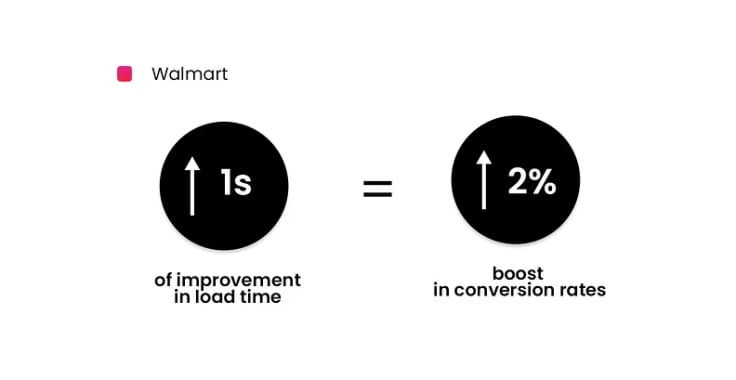
Example: Walmart discovered the power of load speeds when they optimized their website. By shaving just one second off their load time, they saw a 2% increase in conversions. That might not sound like much, but it's a game-changer when you’re dealing with an eCommerce website and millions of dollars in sales.
You can also improve your page speed and website's conversion rate through the following practices:
- Compress images
Large images are often the main culprit for slow load times. Use tools to compress them without losing quality. Web-friendly formats like WebP can help reduce file sizes significantly. - Minimize code
Clean up your HTML, CSS, and JavaScript to remove unnecessary characters, spaces, and comments. Minifying your code speeds up your website by reducing the amount of data browsers need to process. - Use a content delivery network (CDN)
CDNs distribute your content across multiple servers worldwide so that users can access it from a server closer to their location. This reduces latency and improves load speeds, especially for global audiences.
Faster load times mean happier users, better engagement, and more sales. Conversion optimization is a small change that delivers big results. Don’t let a sluggish site hold your business back!
7. A/B test everything
Guessing is the enemy of optimization. When you assume you know what your audience wants, you risk leaving conversions on the table. That’s where A/B testing comes in. It’s a methodical way to determine what works best by testing variations of your website elements. From headlines to button colors, small tweaks can lead to big results.
What is A/B testing? A/B testing, or split testing, compares two versions of a webpage, email, or ad to see which performs better. You show version A to half your audience and version B to the other half, then track which version leads to more clicks, signups, or sales.
Every audience is different; what works for one business might not work for another. A/B testing takes the guesswork out of optimization. By relying on data, you can make informed decisions to improve your user experience and boost conversions.
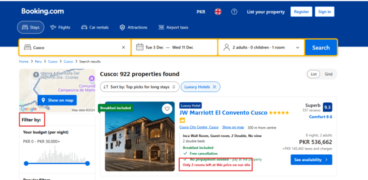
Example: Booking.com is a master of A/B testing. They test everything—from the placement of CTAs to the wording of urgency messages like “Only 3 rooms left!”. Their relentless experimentation has helped them fine-tune their site for maximum bookings, increasing conversions and revenue.
Here are a few elements you can start testing:
- Headlines: Does a playful tone work better than a professional one?
- Call-to-Action Buttons: Try different colors, sizes, or text like “Get Started” vs. “Start Now.”
- Images: Test hero images or product visuals to see what grabs attention.
- Page Layouts: Experiment with placing key elements like online forms and testimonials.
Pro Tip: Test one variable at a time for accurate results. You won’t know what’s driving the improvement if you change too much.
A/B testing is a continuous process, but it’s worth it. Every small win adds up to better performance and higher conversions over time.
8. Use personalization to build a connection
Personalization is now an expectation from your users. Tailoring user experiences shows your audience that you understand their needs, making them more likely to trust your brand and take action.
Today’s customers are bombarded with generic ads, emails, and content. Personalization helps you cut through the noise. It makes your audience feel seen and valued, which increases engagement.
In fact, research shows that 80% of consumers are more likely to purchase from brands offering personalized experiences.
Take Netflix, for example. Its recommendation engine analyzes viewing habits to suggest shows and movies tailored to each user. This approach keeps subscribers engaged and coming back for more.
You can also incorporate it through the following tactics:
- Segment your audience
Group users based on behavior, preferences, or demographics. For example:Frequent buyers: Send them exclusive rewards. - Cart abandoners: Follow up with tailored offers.
- First-time visitors: Provide introductory tips or discounts.
- Use dynamic Content
Personalize your emails and website content to reflect user behavior. For example:Emails that say, “Hi [Name], here’s what you’ll love!” - Product pages that highlight items related to a visitor’s browsing history.
- Leverage retargeting ads
Retarget visitors who’ve interacted with your site but didn’t convert. Show them ads featuring products they viewed or related items to re-engage their interest.
Pro Tip: Personalization doesn’t need to feel intrusive. Keep it relevant and helpful to avoid crossing into “creepy” territory.
By weaving personalization into your strategy, you create a tailored journey that feels like it was made just for your audience. This deeper connection translates into higher engagement, increased website conversion rates, and long-term loyalty.
9. Utilize the power of video content
Video isn’t just a trend for driving engagement. It’s dynamic, attention-grabbing, and simplifies complex ideas in ways text alone can’t. Studies show that adding a video to your landing page can increase conversions by up to 80%. Why? Because people remember 95% of a message when they watch it, compared to only 10% when they read it.
Video builds trust and keeps users engaged longer. Whether it’s a product demo or a customer testimonial, videos offer a richer, more personal experience. They show instead of telling, helping users visualize how your product or service can solve their problems.
To use video content effectively:
- Create product demos
Show how your product works in real-world scenarios. Highlight key features and benefits in action, making it easy for potential customers to see its value. - Use video testimonials
Ask satisfied customers to share their experiences on camera. A genuine testimonial builds trust and shows social proof, which is a strong motivator for new buyers. - Use video ads on social media
Platforms like Instagram, TikTok, and Facebook are ideal for short, engaging video ads. Keep them visually captivating and optimized for mobile viewing.
Keep your videos short and focused, as most viewers drop off after 2 minutes.
Video content is an investment that pays off in higher engagement, trust, and conversions. Start small, and you’ll see big results over time!
Here's an example of a neat product demo (LiveChat is a product you can work with within our Partner Program).
10. Build trust with transparency
Trust is the foundation of every purchase decision. If your audience doesn’t trust your brand, they won’t buy, no matter how great your product is. Transparency removes doubt, builds credibility, and helps you earn the trust needed to drive conversions.
When shopping, customers must feel confident they’re making the right choice. Being open and upfront eliminates hesitation and shows that you value their trust.
To build trust and increase your conversion rate:
- Be upfront about pricing
No one likes hidden fees. Clearly display product prices, shipping costs, and additional charges before checkout. Surprises during checkout are a conversion killer. - Clearly state return and refund policies
Outline your policies in simple language. Customers should know exactly what to expect if they’re unhappy with their purchase. The easier and clearer the process, the more likely they’ll trust you enough to buy. - Use secure payment seals
Display trust badges like “SSL Secured,” PayPal, or credit card logos. These visual cues reassure customers that their payment information is safe.
Pro Tip: Add a dedicated FAQ page to address common concerns and show you’re proactive about customer questions.
When you prioritize transparency, you create an environment of trust that keeps customers coming back. Trust leads to conversions, and conversions lead to long-term success!
Conclusion
Increasing your conversion rate doesn’t happen overnight, but you can start seeing significant improvements by implementing the strategies discussed.
From optimizing landing pages and using A/B testing to building trust with transparency, each step is an opportunity to boost engagement and improve user experience. Remember, it’s about making the process easier, more personalized, and more trustworthy for your customers.
And while optimizing your website and content is key, don't forget the impact of great customer service. Tools like HelpDesk can be crucial in your conversion strategy by providing fast, responsive support, helping customers resolve issues quickly, and keeping them happy.
By continuously refining your approach, testing different strategies, and offering outstanding customer support, you can raise your conversion rates and grow your business.


