Showing top 0 results 0 results found
Showing top 0 results 0 results found

Driving traffic to your website is only the first part of the marketing equation. The next step is to convert those visitors into customers. So how do you convert your traffic?
The answer is with landing pages. These are pages that visitors “land on” after clicking an ad and are typically designed with a specific goal. This could be directly related to profitability like generating sales, or a more marketing-focused goal, like gathering emails.
But just creating landing pages isn’t enough. The key to generating more conversions lies in your copy.
Fail to communicate your value proposition, and your visitors will simply shrug. But capture their attention with a strong offer, and you can expect a boost in sales.
It’s easier said than done, of course. To help you convert your visitors, we’ve put together this list of landing page copywriting tips.
We’ll take a look at the following:
- Craft Compelling Headlines
- Make Your Copy Clear
- Turn Features Into Benefits
- Optimize Your CTA Copy
- Use Social Proof in Your Copy
- Make Your Page Easy to Navigate
- Minimize Friction
1. Craft compelling headlines
The headline is arguably the most important element of your landing page. If your headline fails to grab attention, visitors won’t read the rest of the copy.
David Ogilvy, one of the most influential advertisers in the world, said it best: “On the average, five times as many people read the headline as read the body copy.”
In other words, your headline is pretty important.
A great headline is one that clearly and concisely sums up your offer. It answers the question that most people have on their minds: “What’s in this for me?”
Think about your unique value proposition.
What are the benefits of your offer? How does it solve a customer’s needs? Turn those answers into an irresistible headline that captures the interest of your visitors.
Here’s an example of a well-written headline from Basecamp.
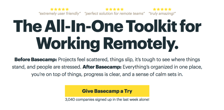
Visitors on this landing page have a clear idea of what Basecamp offers — tools that allow remote workers to organize work easily.
Remember that attention spans are short on the web. You only have a finite amount of time to engage your visitors before they decide to stay or leave. Get straight to the point with your headlines.
Breadcrumbs, an email verifier, keeps its headline short.

Breadcrumbs also gives a simple explanation to catch the attention of its visitors.
2. Make your copy clear
Remember when you had to write school essays?
Some instructors had strict word counts you had to meet for every assignment. If you were a few hundred words short, you might try “padding” your sentences with filler words.
Adding bloat to an assignment may have helped you meet those word counts, but avoid taking the same approach with your landing page copy.
Make your landing page copy clear and get straight to the point. This means avoiding overly complex sentences that serve no purpose other than to confuse your visitors.
As an example, ChatBot uses straightforward copy when describing its product:
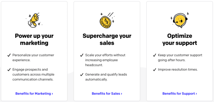
Clear copy helps your visitors understand your offer and how it addresses their needs.
The Conversion Benchmark Report from Unbounce found correlations between the reading ease of a page and its word count to conversion rates.
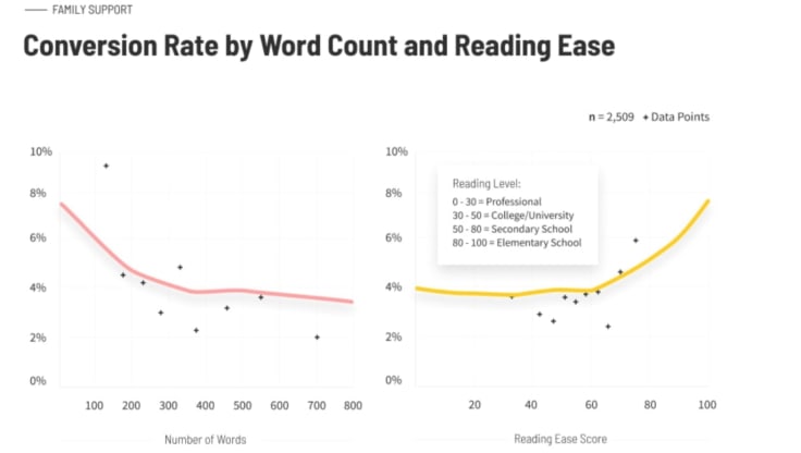
According to the report, landing pages with a higher reading ease score and fewer words converted better.
Here are some tips to writing clearly and concisely:
- Shorten your sentences
- Use adverbs sparingly
- Avoid technical jargon or slang
- Cut out filler words (e.g., just, very, etc.)
- Eliminate redundant pairs (e.g., “each and every”)
- Write in the active voice
Visitors are unlikely to convert if your landing page is difficult to read. Tighten your copy and cut out any filler to improve clarity.
3. Turn features into benefits
Eugene Schwartz, one of the most well-known copywriters, once said, “Talk about what your product ‘does,’ not ‘is’ — and demonstrate this.”
In other words, focus on the benefits of your products or services.
A feature is a distinct attribute of a product (e.g., autofocus), while a benefit describes how it helps the end-user (e.g., helps you capture photos of moving objects).
Many product pages simply contain a list of features and technical specifications. But they fail to communicate why those details matter.
Make your copy more effective by focusing on benefits. Explain how specific features help your audience and why they should care.
As an example, look at how Apple advertised the original iPod:
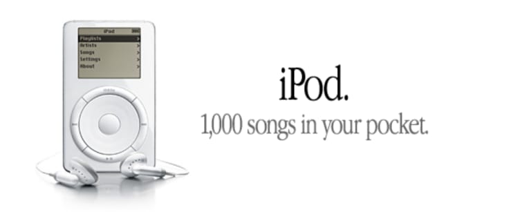
“1,000 songs in your pocket.” That paints a more vivid picture than something like “5 GB of storage.”
Highlighting features in your landing pages is still good practice, as it allows you to differentiate your products. But you should also find ways to turn those features into tangible benefits.
4. Optimize your CTA copy
A call to action (CTA) is another important element of landing pages.
These are lines of text or buttons that tell your visitors what you want them to do next. Examples include purchasing a product, registering for a webinar, or signing up for a free trial.
Button copy directly impacts conversion rates, yet many marketers still use generic phrases like “Click here” or “Buy now.”
Take a look at this landing page from a case study featured on Moz:

These two landing pages are identical. The only difference is the button copy. Can you guess which one performed better?
The page with the “FREE 5-Min Demo Video” button had a conversion rate of 12.73%, while the page with the “Schedule a Demo Today!” button converted at a paltry 1.71%.
These results show how much of an impact a single change can have on conversions.
Use action words that match what you want your visitors to do, and pay attention to the color and placement of your CTA button.
PandaDoc, a document signing software, places its CTA button above the fold and uses contrasting colors to help it stand out.
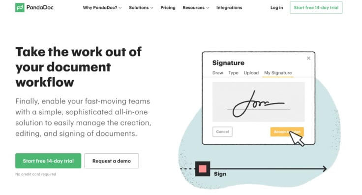
PandaDoc’s visitors can quickly read the headline to understand what the company offers and click the button to start a free trial without having to scroll down.
It’s good practice to optimize CTAs in other parts of your website as well.
For example, using blog posts is an inexpensive alternative to landing pages. Blog posts are informational and allow you to make relevant offers to readers.
Check out this blog post about UGMA vs UTMA custodial accounts from EarlyBird. It provides detailed and helpful information that its target audience is searching for.
EarlyBird has included a CTA that directs visitors to download its app at the end of the article.

Similarly, include and optimize CTAs on your blog post to generate more conversions.
5. Use social proof in your copy
Social proof is a phenomenon where people’s behaviors are influenced by others.
Think about a business you recently visited. There’s a good chance that you read a few reviews first. You’re not alone, as 87% of consumers read reviews for local businesses.
Reviews help us make decisions when we don’t have enough information. Seeing that a local restaurant has received glowing reviews would make you feel more confident about visiting.
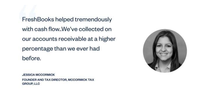
Similarly, you can apply the concept of social proof to your landing pages to increase conversions. One way is to feature customer testimonials.
Here’s an example of a testimonial that FreshBooks features on its homepage:
Another way to showcase social proof is by showing off companies that use your products or services. This lets you leverage their credibility to build your own.
Here’s how Track-POD, a delivery software and tracking app, uses this type of social proof on its homepage.

If you work with well-known companies, show that on your landing page to increase conversions.
6. Make your page easy to navigate
This isn’t necessarily a “writing” tip, but it’s important to optimize the user experience of your landing page. Visitors won’t stay on your site if it’s difficult to navigate.
If your landing page has many sections, consider adding bookmarks that can help your visitors easily find what they’re looking for.
This page from Buzzsprout on how to start a podcast is the landing page for a PPC ad on “podcast software.” Because there’s a lot of content on the page, the company has provided bookmarks at the top of the page to skip past irrelevant content.
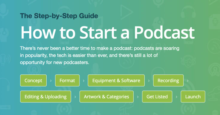
This reduces bounce rate because readers don’t have to sift through irrelevant content to find the information they’re looking for.
7. Minimize friction
You’ve spent a lot of time writing your copy and getting the messaging right. But conversions are still relatively flat.
Visitors may click away because of friction — barriers that prevent them from taking a desired action (e.g., making a purchase, signing up for a trial, etc.).
Examples of friction include lengthy forms or a lack of payment options. Another source of friction is when visitors have to perform extra steps after clicking a link.
This landing page reviewing Credit Saint makes it easy for customers to convert on to the listed partner’s site. The links under each listed credit repair company take visitors directly to the company’s registration page.

To drive more conversions, you need to identify and reduce friction. Conduct usability tests to pinpoint any areas where visitors are getting stuck. Then take steps to address those issues.
Final thoughts
Landing pages are arguably one of the most important pages, as their job is to turn visitors into customers. But marketers often struggle to get results.
The average conversion rate for landing pages across industries is a paltry 2.35%. If your landing pages aren’t converting, then you’re leaving sales on the table.
A good place to start is your landing page copy. By clearly communicating the value of your products or services, you can engage and convert more of your visitors.
Follow the tips laid out here to increase conversions — craft compelling headlines, optimize your CTA copy, leverage social proof, improve the user experience, and minimize friction.
Don’t forget to test your landing page copy so you know what works and what doesn’t.


